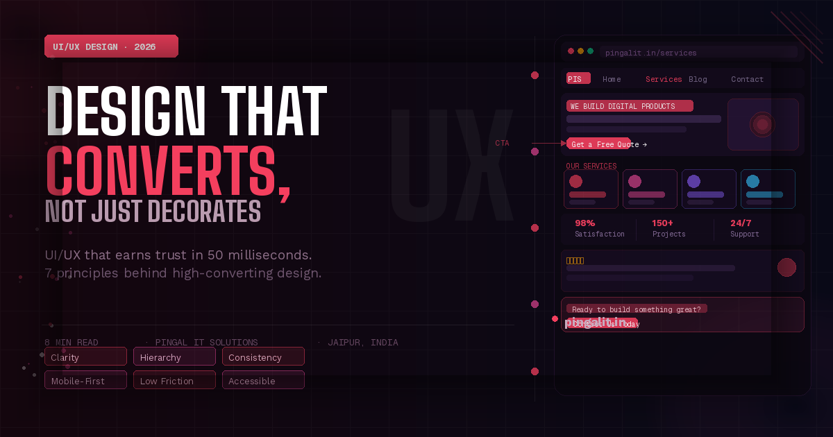
Why Good UI/UX Design Is the Difference Between a Website That Converts and One That Just Exists
Introduction
Two businesses. Same service. Same pricing. Same city. One website consistently generates enquiries, quote requests, and calls. The other gets traffic but almost nothing else.
The difference, more often than not, is not the content. It's not the SEO. It's not even the offer. It's the design.
UI/UX design — the way your website or app looks and the way users move through it — is the invisible force behind every conversion, every bounce, and every "I couldn't figure out how to contact them" that you never hear about. In 2026, with users making snap judgements in under 50 milliseconds and competition just one tab away, design is no longer a finishing touch. It is a core business function.
This guide explains what UI and UX actually mean, why they matter more than most business owners realise, and what separates design that performs from design that merely decorates.
UI vs. UX — What's the Actual Difference?
These two terms are often used interchangeably, but they refer to distinct disciplines that work together:
UI — User Interface Design
UI design is concerned with how things look. It covers the visual elements of your product — colours, typography, buttons, icons, spacing, imagery, and layout. A UI designer ensures that every screen is visually consistent, aesthetically considered, and aligned with your brand identity.
Think of UI as the interior design of a physical store — the lighting, the fixtures, the signage, the way products are displayed. It shapes first impressions and communicates professionalism (or the lack of it) instantly.
UX — User Experience Design
UX design is concerned with how things work. It covers the entire journey a user takes through your product — how they find what they need, how many steps it takes to complete an action, where they get confused or frustrated, and how they feel when they leave. A UX designer researches user behaviour, maps user journeys, creates wireframes, and tests prototypes to ensure the product is intuitive and effective.
Think of UX as the layout of that same store — whether the entrance is obvious, whether products are logically grouped, whether the checkout queue is fast and clear, whether customers leave satisfied or confused.
💡 The key insight: You can have a beautiful UI with terrible UX — a visually stunning website where nobody can find the contact button. You can also have excellent UX with dated UI — a functional site that works well but looks unprofessional. The goal is both: a product that looks great and works intuitively.
What Users Actually Do on Your Website — And Why It Matters
User behaviour research consistently reveals a gap between what business owners assume users do on their websites and what users actually do. Here are the findings that most change how businesses approach design:
- Users spend an average of 5.59 seconds looking at a website's written content before deciding whether to stay or leave
- 79% of users scan rather than read — they look for headings, bold text, bullet points, and visual anchors, not paragraphs
- F-pattern and Z-pattern reading — users read the top of the page across, then scan down the left side. Content placed outside these patterns is frequently missed entirely
- The average user forms a first impression in 50 milliseconds — before they have read a single word
- 88% of users are less likely to return to a site after a bad user experience
- A well-designed UI can increase conversion rates by up to 200%, while a superior UX design can yield conversion rates up to 400% higher
These numbers reframe the role of design entirely. It is not art for art's sake. It is the primary mechanism through which your website either earns or loses the business it was built to generate.
The 7 Principles of High-Converting UI/UX Design
1. Clarity Above All Else
The most important question to ask about any page on your website is: "Does a first-time visitor immediately understand what this business does, who it serves, and what to do next?" If the answer requires more than three seconds of reading, the design has failed at its most fundamental job.
Clarity means a clear headline that communicates your value proposition, a visible and specific call to action, and a layout that guides the eye naturally from interest to action without requiring effort from the user.
2. Visual Hierarchy — Guiding the Eye
Not all elements on a page deserve equal attention. Visual hierarchy is the art of making the most important elements the most visually prominent — through size, colour, contrast, spacing, and position. A page without visual hierarchy is a page where users don't know where to look, so they look everywhere and act nowhere.
Strong visual hierarchy means your headline is the biggest thing on the page, your CTA button is the most visually distinct element, and supporting information is visually subordinate — present but not competing for attention.
3. Consistent Design Language
Consistency builds trust. When every page of your website uses the same fonts, the same colour palette, the same button styles, and the same spacing system, users subconsciously register this as professionalism. When pages look inconsistent — different fonts here, different button colours there — users feel uncertain, even if they can't articulate why.
A design system or style guide ensures that every element across your entire product is intentional and consistent, whether built by one designer or ten.
4. Mobile-First Design
With over 80% of Indian internet traffic coming from mobile devices, designing for desktop first and then adapting for mobile is designing in the wrong order. Mobile-first design means making the constraints of a small screen — limited real estate, touch navigation, variable connection speeds — the primary design constraint, with desktop being the enhancement rather than the default.
A mobile-first approach produces cleaner, more focused designs that work beautifully on every screen size.
5. Friction Reduction — The Fewer Steps, the Better
Every additional step, form field, click, or decision you ask a user to make is an opportunity for them to give up. High-converting UX design relentlessly reduces friction — shortening forms to only essential fields, making the primary action available with one click, removing any step that doesn't directly serve the user's goal.
Ask yourself: if a user wanted to enquire about your services right now, how many taps or clicks would it take? If the answer is more than two, that's friction worth removing.
6. Loading States and Feedback
Users need to know that the system is responding to their actions. When a button is tapped and nothing visibly happens, users tap it again, and again, creating errors and frustration. Good UX design ensures every interactive element gives immediate visual feedback — buttons change state when tapped, forms confirm submission, loading states communicate that something is happening.
This is invisible when done well and infuriating when absent.
7. Accessibility — Designing for Everyone
Accessible design is not charity — it is sound business practice. An estimated 15% of the global population has some form of disability that affects how they interact with digital products. Accessible design — sufficient colour contrast, keyboard navigability, screen reader compatibility, appropriately sized touch targets — ensures your product works for the widest possible audience.
Beyond the moral case, Google factors accessibility into its quality assessments, and accessible sites consistently perform better in search.
Common UI/UX Mistakes That Cost Businesses Conversions Every Day
These are the design errors that quietly drain enquiries and revenue from business websites across India — and they are entirely fixable:
- No clear call to action above the fold — users should not have to scroll to find out what to do next
- Contact forms with too many fields — every extra field reduces completion rates. Name, email, and message is usually sufficient for a first enquiry
- Low contrast text — grey text on a white background may look minimal and stylish; it also makes your content unreadable for a significant portion of your audience
- Auto-playing video or audio — universally disliked by users, and a fast path to an immediate bounce
- Cluttered navigation — a navigation menu with twelve items is a navigation menu that helps nobody. Ruthless prioritisation of the most important pages is a design decision, not a compromise
- Inconsistent button styles — when some buttons are filled, some are outlined, and some are text links, users don't know which ones are primary actions and which are secondary
- No social proof near CTAs — a testimonial, a client logo, or a review rating placed adjacent to your call to action dramatically increases the likelihood of action
- Broken mobile layouts — content overflowing screens, text too small to read, buttons too small to tap. In 2026, a broken mobile experience is simply an unusable product for the majority of your visitors
The ROI of Good Design — Making the Business Case
Design investment is often treated as a cost to be minimised. The data consistently argues the opposite:
| Design Investment | Measurable Business Impact |
|---|---|
| Improved visual hierarchy & CTA placement | 20–80% increase in click-through rates on key actions |
| Contact form simplification | Up to 50% increase in form completion rates |
| Mobile UX optimisation | 30–60% reduction in mobile bounce rate |
| Page load + UX improvement combined | Up to 400% improvement in conversion rate (Forrester) |
| Consistent design system implementation | 33% reduction in development time for future features |
Companies that prioritise design outperform their industry peers by a significant margin. McKinsey's Design Index found that design-led companies outperformed the S&P 500 by 211% over ten years. The principle scales down to SMBs just as effectively.
What a Professional UI/UX Design Process Looks Like
Strong design is not a matter of taste — it is a structured, research-driven process:
- Discovery & User Research — understanding who your users are, what they need, and where current designs are failing them. This includes user interviews, competitor analysis, and analytics review.
- Information Architecture — defining the structure and navigation of your product. What pages exist? How are they connected? What is the most logical path from entry to conversion?
- Wireframing — low-fidelity layouts that define the placement and hierarchy of every element, without the distraction of colour and visual detail. Decisions made at wireframe stage are fast and cheap to change.
- Visual Design — applying your brand identity, colour palette, typography, and visual language to the wireframes. This is where UI design comes to life.
- Prototyping — interactive mockups that simulate the real product, used for stakeholder review and user testing before a single line of production code is written.
- User Testing & Iteration — real users interact with the prototype and reveal assumptions that were wrong. Designs are refined based on evidence, not opinion.
- Developer Handoff — precise design specifications delivered to developers, ensuring what is built matches what was designed.
How Pingal IT Solutions Approaches UI/UX Design
At Pingal IT Solutions, Jaipur, design is not a step we rush through to get to development. It is the foundation on which every project is built — because we know that the most technically excellent application in the world will fail if users find it confusing, frustrating, or untrustworthy.
Our design process is collaborative and transparent. You review and approve wireframes before visual design begins, and visual designs before development begins. There are no surprises at launch — because you have seen, tested, and signed off on every screen before it is built.
We design for your specific users, your specific business goals, and your specific brand — not from templates or generic patterns that look like every other website in your industry.
Conclusion
Good UI/UX design is not about making something pretty. It is about making something that works — for your users and for your business. It is the difference between a website that generates enquiries and one that generates only bounce rates.
In a market where every competitor is just one Google search away, the businesses that invest in design earn trust faster, convert better, and retain customers longer. The ones that treat design as an afterthought pay for it in invisible, unmeasured losses every single day.
If your website or app isn't performing the way it should, the answer may be simpler than you think. Talk to Pingal IT Solutions — we'll review your current design, identify where users are dropping off, and show you exactly what a redesign could do for your conversion rates.